Content Options
How the websites are built
The website examples you can see here, and all the Virtual Packages the Digital Services team deliver, are built in a Content Management System (CMS). This means that every site is made up of content slices that can be added, deleted or moved around, providing flexibility to design an arrangement of content slices that is right for your event and target audience.
Blackbaud has worked closely with partner charities to ensure that the websites are accessible to all users and are also fully mobile optimised.
Blackbaud's Browser Support Policy.
If you have any specific accessibility or optimisation requests, please contact the Digital Services team and your requirements can be discussed.
Examples of content slices
A full list and some examples of available content slices can be found below.
- Buttons
- Image Carousel
- Content (for copy only)
- Content image (for copy & image)
- Countdown
- Donation Ticker
- Dynamic Banner
- FAQs
- Fitness Leaderboard
- Fundraising Leaderboard
- Gallery
- Grid Content
- Progress Bar
- Social Feeds
- Static Banner
- Supporter Search
- Supporter Tiles
- Totalisers (amount raised, number of supporters, number of donations, distance completed etc)
- Video
Buttons on your website
Buttons can be used throughout your website to link to new pages and encourage your fundraisers to take actions. The most commonly used buttons include the 'Donate' and the 'Sign up' call-to-actions.
We can change the size and shape of the buttons if required (e.g. make the button corners rounder or the space around the text bigger). Your buttons can link anywhere you like, and are not restricted to the 'Donate' or 'Sign up' call-to-actions.
The image carousel
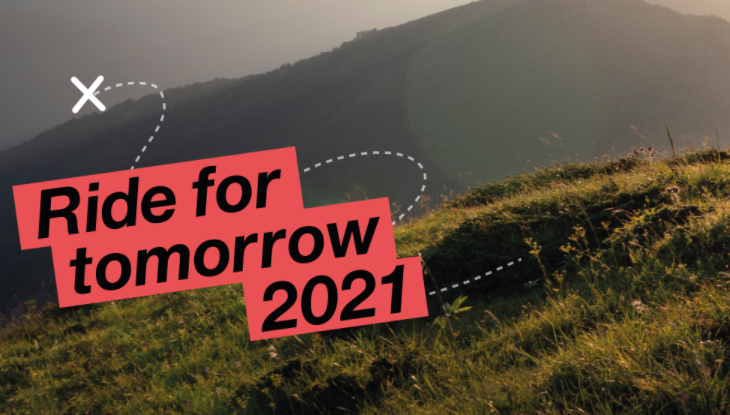
An Image Carousel allows you to add multiple images that users can scroll through. The scroll can be set to automatic (the user will not need to click through) or manual (where the user clicks through the images, per the below example).
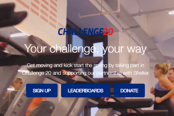
It is possible to add text and buttons above your images if required - see the examples below.
Images can be supplied in any size (any width x any height) but we recommend using the same size images. For example, all the images below are 730px wide by 415px wide. All images should be supplied as PNG or JPEG files.
Content slice (for copy only)
Our most basic content slice is where all copy on your website will be added. Copy can be left, right or centre aligned (left alignment is most accessible). By default, our copy will be placed on the website as 16px / 12pt / 1em size, but if you require your copy to be larger or smaller on your website, we can accommodate this. If you do not provide a custom font, we will use Arial or Lato as a default font on your website.
All copy should be provided in Word format. Please clearly label where you would like your copy to sit across the website. There is no word limit, but try to be concise and stick to your key cause messaging and include information about your event - the who, what, where, why, how and when.
Adding a content image
The Content Image slice is perfect for those times when you want to add an infographic or picture with some copy sitting alongside! The image can be left or right aligned. It can be any size, the image in this example is 600px wide by 400px high. Please supply any image as a PNG or JPEG, and clearly label any copy that should sit alongside the image.
Add a countdown to your event!
Build the hype for your event and add a Countdown to your homepage, counting down to the event start date. It's an effective, simple way to get your audience engaged with your event.
A donation ticker
The donation ticket pulls a combination of donor names, amounts and comments on a scrolling feed across the webpage. It allows you to showcase your invaluable donors and give them the credit they deserve! The ticker pulls the information from the campaign that is set up in the backend and powers the website.


Dynamic banner
If you'd like to overlay some text and / or buttons of your header banner on your landing page or homepage, then you should consider using a Dynamic Banner. Your banner can be a static image (recommended if the majority of your traffic comes from mobile) or a video. The image you supply should be 1480px wide by any height and should be supplied as a PNG or JPEG file. For reference, the image below is 1480px by 834px.
NB: Please note, if you choose to add a video banner, it is out of the package scope to resize the video to a static image for mobile users.
Frequently asked questions expandable/collapsible content
This content slice is most often used on the FAQs internal page of our websites. It's useful when you want to add a lot of information, but do not want your users overwhelmed with a lot of content on a page. Perfect for FAQs!
Category One
Question One
Answer One
Question Two
Answer Two
Question Three
Answer Three
Category Two
Question Four
Answer Four
Add a fitness leaderboard
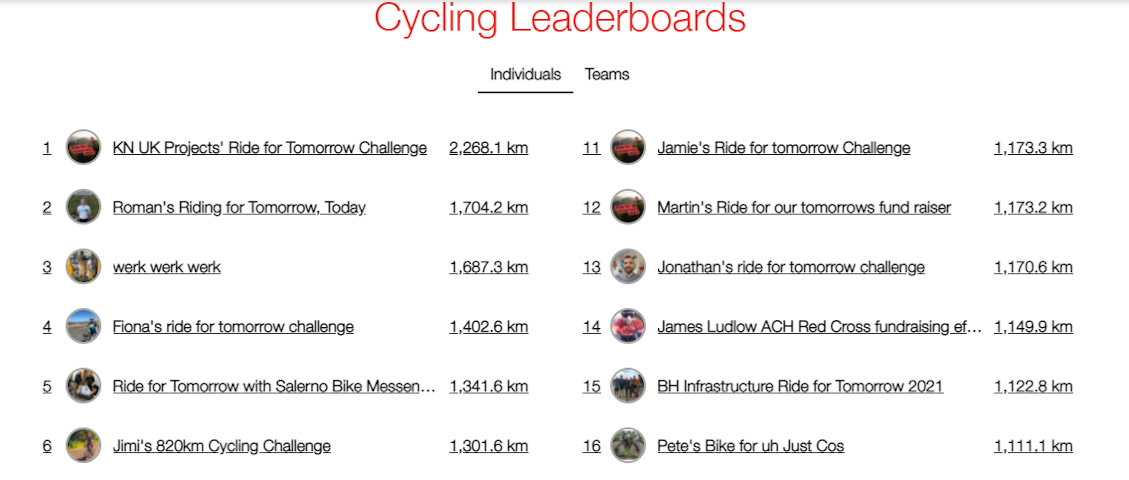
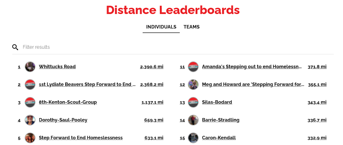
The fitness leaderboard content slice is powered by JustGiving and pulls its data from the campaign set up in the backend. It displays up to 20 fundraisers in order of who has logged the most fitness activities and has covered the most miles / KMs etc throughout the event period. It is possible to display both individual and team fitness in the leaderboards. You can see a couple of examples below.
Utilise fundraising leaderboards
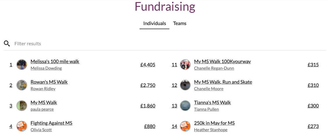
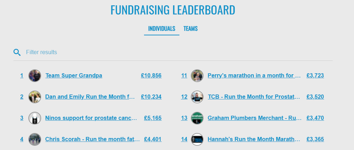
The fundraising leaderboard content slice is powered by JustGiving and pulls its data from the campaign set up in the backend. It displays up to 20 fundraisers in order of who has raised the most money on their fundraising page throughout the event period. It is possible to display both individual and team fundraising in the leaderboards. You can see a couple of examples below.
A gallery of images
If you want to break up a lot of copy and add some extra images on your website, the gallery is a perfect solution.
Your images should be 1280px wide by any height, although we recommend you use the same height for all the images in your gallery. All images should be supplied as PNG or JPEG files, and don't forget alt text for accessibility!
Lay out content in multiple columns with grid content
The grid content slice is really useful for laying out information in steps, or where you want small snippets of copy side by side. A great example of grid content in action can be found on The MS Society's homepage for My MS Walk 2021.
It is possible to add images to grid content as well, along with buttons if you want to have a call-to-action. It is possible to have 2 - 6 columns, although we generally recommend having no more than 4 columns, to ensure copy doesn't look too squashed. Images can be any size. For reference, the images in the example below are all 350px wide by 200px high.

ARUK
Give Five
View the Alzheimer's Research UK Give Five website.

Level Up for Framework
View the Level Up for Framework website.

Deutsche Bank & Young Minds
View the Deutsche Bank supporting Young Minds website.
Add progress bars for fitness or fundraising
Progress bars are a great way of visualising funds raised, distance travelled or donations received.
It's possible to edit the progress bars to make them rounded or square, and the colours can be either your primary, secondary or tertiary colours provided when you submit your assets.

Build a community with a social feed
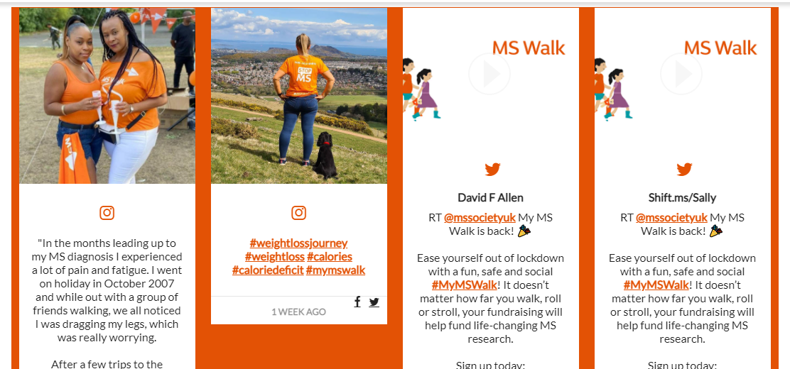
Connect your supporters and build a sense of community by incorporating a social feed onto your website. It's possible to pull a social feed from the following three sources:
- Curator.io. If you want to use Curator.io, you need to set up an account on their platform, create the social feed you want within your account and publish. Once it is published, you'll receive a code snippet for the feedback that you can pass onto the Digital Services team to ensure the feed gets pulled through on your website. The code snippet will look something like the below example.

- Juicer.io. If you want to use Juicer.io, you need to set up an account on their platform, create the social feed you want within your account and publish. Once it is published, please supply the Digital Services team with the Juicer feed slug and your social feed will be added to your website.
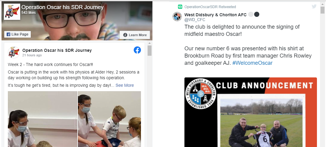
- Finally, you can opt for a simple version of the social feed. If you choose this option, you'll need to supply the short URL from both your Facebook and Twitter pages e.g. /charityname or /eventname. The feed will then be set up to pull through two streams, one from Facebook and the other from Twitter.
If you want to pull through your social feed using hashtags or you'd like to incorporate Instagram posts, using either Juicer.io or Curator.io is the best option. The simple feed does not allow you to pull through anything other than a basic Facebook and Twitter feed.
Curator.io / Juicer.io social feed example
Basic social feed example
Using a static banner
Static banners are usually what is added as a header at the top of each page on your website. The image you supply should be 1480px wide by 450px high for desktop, and 1480px wide by 750px high for mobile. The banner assets should be supplied as a PNG or JPEG files. Alt-text will be added to the banner when supplied, although if you have specific alt-text requirements, please supply this alongside the banner assets.
Two example banners are below, the first sized for desktop and the second sized for mobile.


The supporter search
Supporter search functionality allows your fundraisers and supporters to find fundraising pages and click through to them to then donate to them or use them in any other way required. The supporter search only looks up individual fundraisers and does not have team search functionality.


Supporter tiles on your website
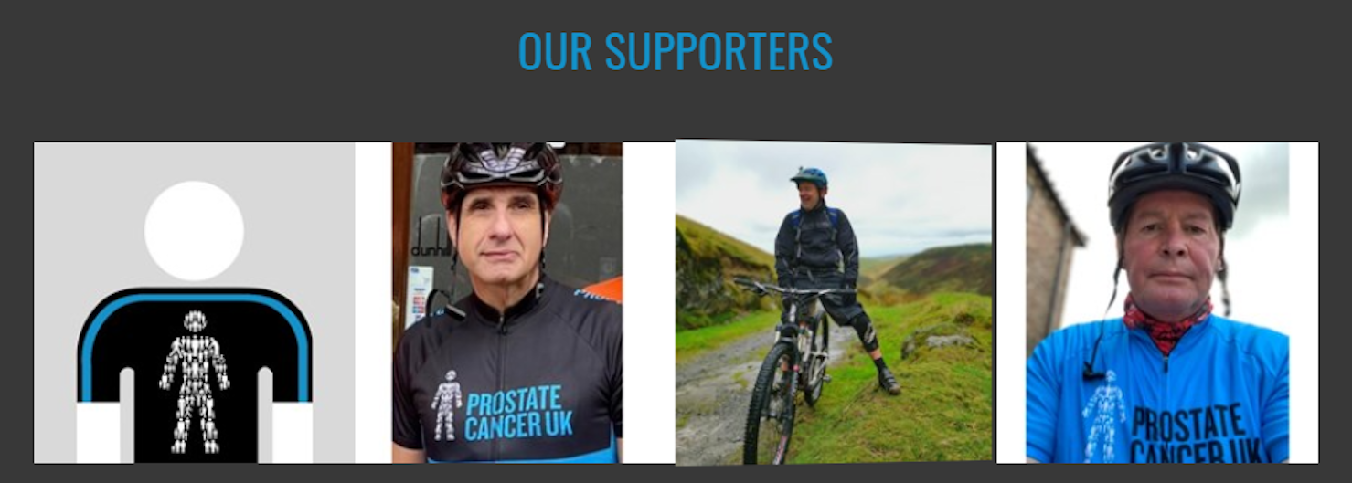
Supporter tiles are a great way of building a 'wall' feature of your fundraisers who are participating in your event. You can display up to 50 fundraisers in one block, and the tiles flip from the user's fundraising page profile image to showcase the amount they've raised and their fundraising page name. It's a fun, interactive feature and a great way to showcase your supporters in one place without a competitive element.
The two examples below show how the tile flips to reveal the fundraising page name and the amount raised by that individual when the mouse hovers over the tile.

Totalisers, or fundraising metrics
Totalisers are powered by JustGiving and the data is pulled from the campaign set up in the backend. It is possible to display the following totals:
- Number of fundraisers
- Number of donations
- Total amount raised (not including Gift Aid)
- Collective distance travelled OR collective hours completed
- Number of teams
You can see an example below, not including the teams counter. Distance or hour totalisers remain off or are not populated until the event period, as distance is not tracked until the dates between event start and event end.


Adding a video
Adding a video into your site helps to engage your audience and break up long pieces of copy too. Videos pull from either YouTube or Vimeo and must be supplied as a URL rather than an MP4 file. You can add multiple videos to one website if required.
It's possible to have the video sit across the page, or per this example, align it either left or right next to a chunk of copy.

